An overview of design principles applied to web sites.
Unity refers to joining visual elements into a complete image.
With web design it is important that a page design and all pages of a site feel unified, consistent, and give a sense of identity.
Following are various methods that can be applied to create unity.
Color – use of a single color or similar hues
Shape – circles, rounded box corners, square, etc.
Textures – smooth, wood, metal, etc.
Proximity – placement of objects close together or overlapping
All of these items can work together to create harmony and form a pleasingly consistent view.
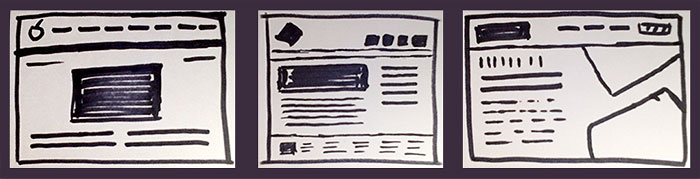
The Focal Point is the center of interest and should be easy to identify.
With web design, the purpose of the page helps determine the visual emphasis. This could be a logo and tagline however depending on the page content; this could also be an image, product shot, color, or headline.
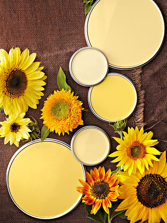
Various shades of yellow, Source: BHG.
All white circles and squares
Naturally our eye is drawn to images of the human face and our attention automatically shifts in the direction someone else is looking. Unless the face is the emphasis, be careful not to overpower and loose the importance of the page.
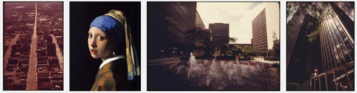
Which image grabs your attention first? Source: Google Image Search Screenshot
A balanced design is comfortable and pleasing to view.
Various elements work together to communicate the message. An un-balanced composition can create tension and be confusing (this is sometimes the desired outcome). In the physical world, an unbalanced skyscraper could fall over however, with precise placement the mobiles of Alexander Calder float effortlessly.
Visual weight measures the amount of attraction an element receives.
Symmetrical balance occurs when equal objects are presented on either side of a central axis; like a mirror. This can be considered very formal and straightforward design as well as easy to comprehend. It can also be considered static and over time, boring.
Asymmetrical balance occurs when equal visual weights are presented. The objects can be different and yet balance is achieved by size, color, shape, position, texture, or visual direction. Arrows can effectively give direction and direct attention. Asymmetrical balance can be very interesting and also give a feeling of movement with visual variety. Compared to symmetrical, asymmetrical balance can be more difficult to successfully achieve.
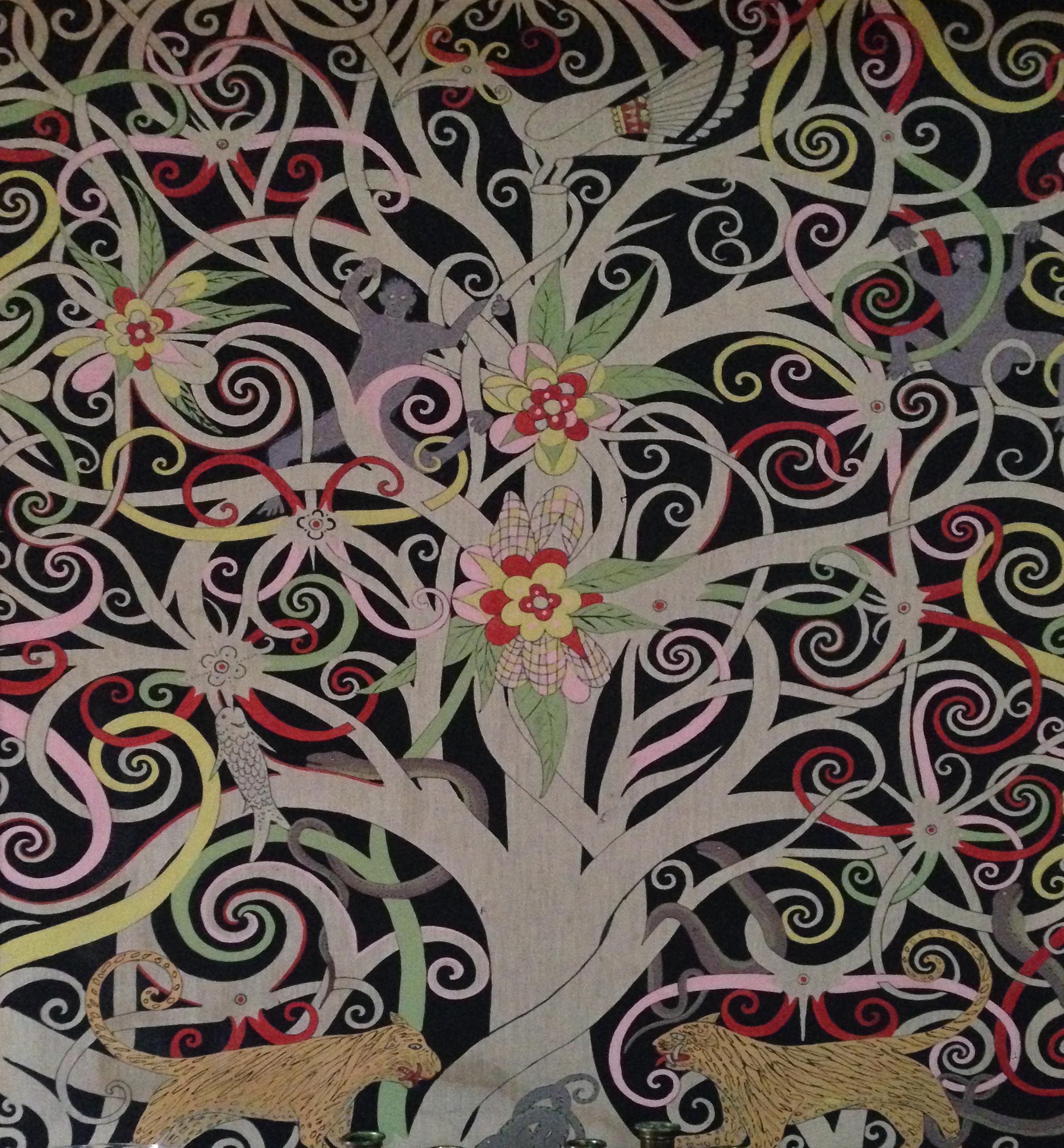
Artwork with Balance
A line is a mark with length and weight.
Along with arrows, a line can direct the viewer’s eye. Lines can be grouped together to create shapes and separate the interface into meaningful areas.
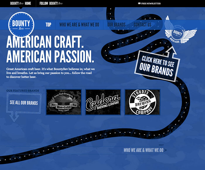
Arrows and lines give the user direction.
Fundamentally, design is the arrangement of shapes.
Shapes are areas confined by lines or colors and generally defined as two types: geometric and organic. Examples of geometric shapes are square, triangle, circle, or star while nature inspires organic shapes: pond, clouds, flower petals, etc.
White space is the empty or unmarked area around objects.
This is the area of a design that is un-marked and can consist of margins, padding, line height, space around images or graphics. A design with little white space can appear cluttered and hard to read, although more space means less content. Keep in mind, white space is not always white.