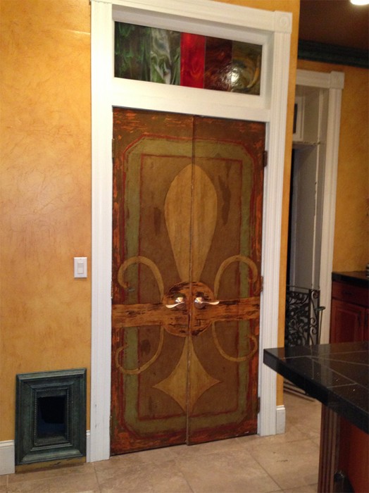
We live in an old house (150+ years) with many period characteristics: 10 inch molding, 6 panel doors, high ceilings. After installing the home’s first central heating and air we turned our attention to updating the kitchen. Some of our challenges included: a 5 inch sloping floor, a cellar door in the floor, and a used-to-be bathroom that took up 25 percent of the space.
In order to still allow access to the cellar, we incorporated a pantry around the cellar door. The door height matches all the other doors along with a transom. I am a big fan of re-use, so we acquired doors from Habitat for Humanity. They were heavy solid wood, but did not match anything else. Instead of painting them consistent with the other doors, I decided to make them obviously different. When you see the doors, you don’t compare them with anything else in the room. They make their own statement yet fit within the character of the house.
In design, the elements of contrast and repetition give consistency. When used well this also gives opportunity for additional interest and unexpected surprises while maintaining a solid flow.


