Please don’t “Click Here”. I believe good interactive design should provide clues and information to guide the user. A link with a strong call to action and the conventional link color change usually works well. Buttons should have a “touch me” appearance to entice users to interact. This can be accomplished by referring to the real world for inspiration and adding shadows and depth to graphics. I am always striving to combine form and function for the best user experience.
A recent project involved showcasing images and providing a link to a web page for more information. The page layout consist of image thumbnails and image titles. Clicking on a thumbnail enlarged the image in a lightbox view with previous and forward buttons to view additional images. Clicking on the title goes to a full page devoted to the image. To fit within the client’s budget, image functionality needed to be consistent throughout the site.
I discovered that some users only looked at the images and never realized that the title would take them to a page with more details. How could I convey to users that the title would give more information without writing instructions?
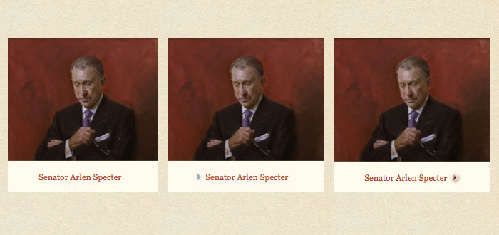
Refer to the image above:
- The title as a link is not enough.
- An arrow at the beginning of the title started to imply more information but still not clear.
- Final solution, an arrow included within a visual button placed at the end of the title. The placement implies moving forward and the button makes one want to click.
Good design is about finding ways to effectively communicate necessary information and treat users intelligently.
Images courtesy of portrait artist Michael Shane Neal.


